SAP’s story is one of a steady rise from a small, five-man operation headquartered in southwest Germany’s Rhine-Neckar region to one of the world’s largest independent software providers and an employer of more than 47,598 people in over 50 countries.
Let me break those 37+ YEARS IN decades
1972 – 1981: The First 10 Years
SAP R/2 Developed by SAP and made a good hits on ERP Market!!!
SAP R/2: Architecture Contains:
a) Presentation Layer
b) Application + Database Layer
The limitation of 2 tiers is its speed of response. Since Application layer sits along with Database layer, every time you fire a query, application layer has to get details from Database.
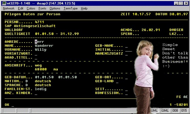
The R/2 user interface is based on terminal screens, which are often simulated by “terminal” programs on machines with a graphical user interface (UNIX, OS/2, Windows)
1982 – 1991: The SAP R/3 Era
So here is the Champ SAP R/3!!!!!!!
SAP R/3 .Version 1: Architecture
a) Presentation Layer
b) Application Layer
c) Database Layer
This architecture got many advantages: It is faster as we have Buffering concept for the application server, load balancing to handle maximum calls etc…
Other Details are :
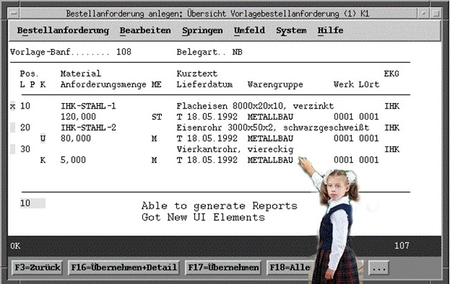
- First “graphical” user interface for SAP software, typically in OSF/Motif look (OS/2 was strong then, too).
- Tables are created using the Step loop technology.
- There are no graphical elements, such as group boxes, checkboxes, radio buttons, table control, tab strip, icons (or even more advanced ones) available.
- Duality of dynpro technology (screen with fields, tables etc.) and ABAP list technology (used for interactive reporting). Both technologies cannot coexist on one screen.
R/3 Version 2
New features for this version:
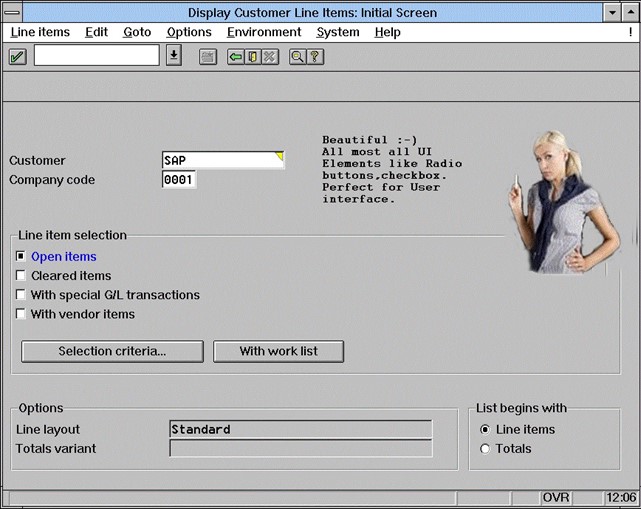
- New Windows GUI (Windows 3.1; other supported platforms are OSF/Motif, OS/2 and Mac OS)
- Windows look and feel (a little…)
- No leading dots for field labels
- 3D look for entry fields
- System and Application Toolbar
- Icons in System Toolbar
1992 – 2001: The Age of E-Business
R/3 Version 4.6
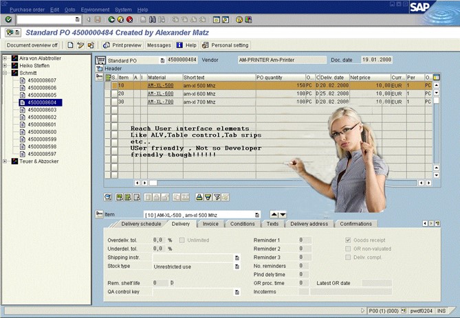
The GUI is “reinvented” (in cooperation with frog design) to allow for a new look and feel, as well as for branding.
A new application design with a multiple-area approach introduced as an attempt to get rid of initial screens and to reduce the need for screen changes.
2002 to Today: SAP Today:
This part is the one i like to discuss more!!!!! Because it’s time when you can see more colours on your sap screen J.
Improvement towards the web applications too, where Webdynpro for abap/ java made it more beautiful and user friendly.
The development is easy as it is drag and drop where developer can focus on the business logic more than compare to wasting his/her times in layout designing. Integration with the Adobe forms and flex/Flash Island make it more User friendly. On other side BSP accelerated their UI and made it to Reach Mobile applications using JQuery.
Check out the below link for more details: (it’s a library for UI )
http://www.sdn.sap.com/irj/scn/elearn?rid=/library/uuid/a0c91fc0-932d-2c10-4ca7-f5774950c8e3&overridelayout=true
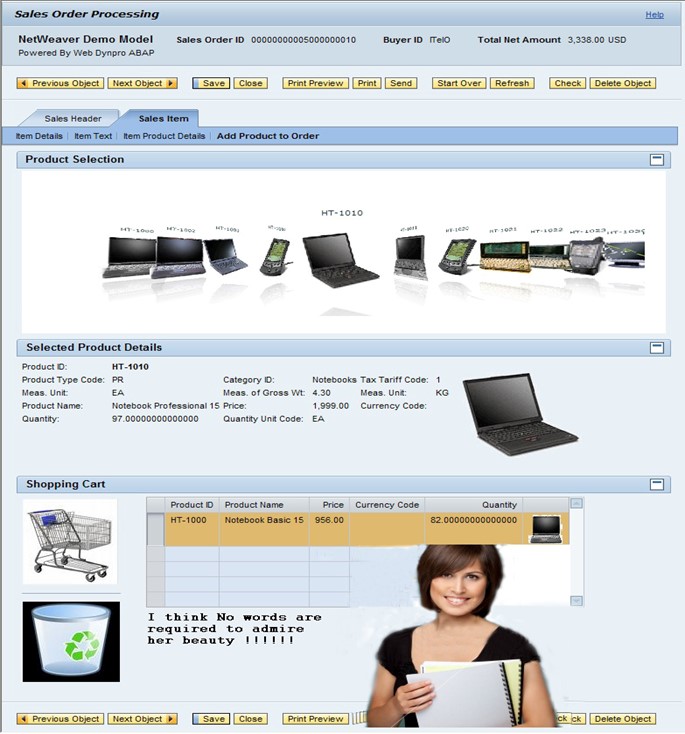
SAP Also launched HTML5 based fiori user interface where yes we can say SAP is not lagging behind other technologies when it comes to User interface and providing fun screens to work with.
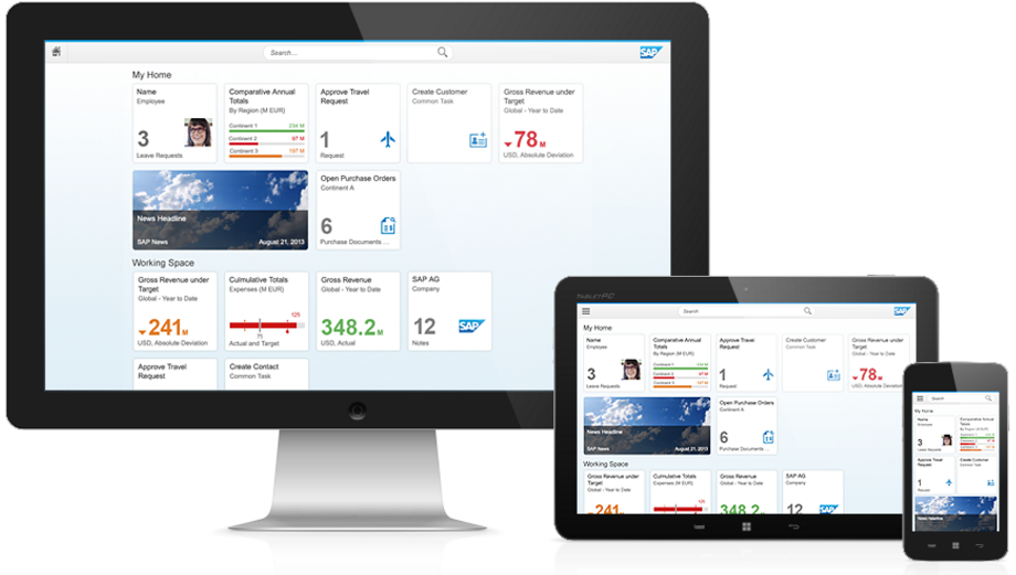
Now I know what you are thinking?
If SAP is able to make such a beautiful girl Uppssss Beautiful Screens why we have still those old GUI?
Let me clarify your doubt in craig mail’s words
“Why should SAP invest on changing the GUI of all 50,000+ screen of SAP where as business can able to work on it , Also it requires too much investment to redesign those screens and also requires to train the SAP User for new GUI.!!!!!!”
So in short Old SAP Development will remain the same But Don’t worry as SAP’s Future Development will be Colourful and beautiful.

